

Creating a React Modal with React custom Hooks and Typescript

I am a developer from India with a good eye for frontend logic and design. I am also well acquainted with the backend and business logic so that's add to my ability to create a good frontend while making it easily integratable with backend.
Hello Guys,
React hooks are very useful features of React and with this comes custom React hooks, these custom React hooks have endless possibilities and can easily replace container Logic in Container/Presentational Model.
Read more about that here Patter.dev
Creating the Modal from Scratch
Creating the Presentational Part of Modal
Let's create the presentational part of the Modal in this I will be quick and just show you the code
import React, { ReactNode } from "react";


interface ModalType {
  children?: ReactNode;
  isOpen: boolean;
  toggle: () => void;
}

export default function Modal(props: ModalType) {
  return (
    <>
        <div className="modal-overlay" >
          <div  className="modal-box">
            {props.children}
          </div>
        </div>
    </>
  );
}
let me explain this to you, So here we have two div an overlay-div which have full width and height, and a modal-box div.
So we are trying to achieve something like below where if the user clicks anywhere else than the modal-box div the modal will get closed. And all the modal content will be inside the white part of the modal.
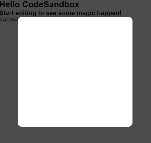
let's quickly set up the CSS for our modal divs.
.modal-overlay {
  z-index: 9999;
  width: 100vw;
  height: 100vh;
  position: absolute;
  top: 0;
  background: rgba(0, 0, 0, 0.7);
  display: flex;
  justify-content: center;
  align-items: center;
}

.modal-box {
  display: block;
  background: white;
  width: 70%;
  height: 70%;
  padding: 1rem;
  border-radius: 1rem;
}
once this is done we need will get to our logic part where we will only render the Modal if our state is true.
Why custom Hook?
Here I used a custom hook so that I don't have to write the same logic again and again when trying to use modal and add the same function in all the files.
Adding logic to the Hooks
let's quickly make a new file useModal.tsx in our hooks folder this will be a pure function and only contain the logic for now.
// useModal.tsx

import { useState } from "react";

export default function useModal() {
  const [isOpen, setisOpen] = useState(false);

  const toggle = () => {
    setisOpen(!isOpen);
  };

  return {
    isOpen,
    toggle
  };
}
In this, we have a state isOpen to show or hide the modal, and then there is a function that actually toggles the visibility of the Modal.
now let's use this code in our App.tsx and implement a Modal that gets triggered on click
Combining the logic and Presentational Part ( hooks + Modal component)
Calling the Modal component and useModal
let's import out the Modal component and useModal hook in App.tsx
import Modal from "./component/modal";
import useModal from "../src/hooks/useModal";
let's add the other logic and pass isOpen and toggle to the Modal component.
our App.tsx will look something like below
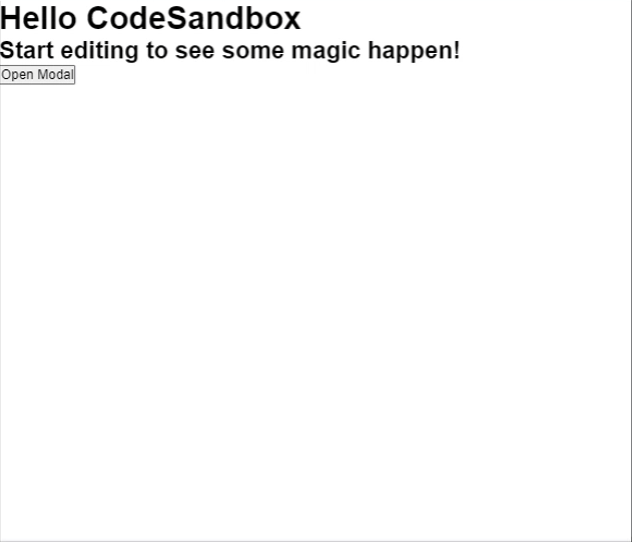
export default function App() {
  const { isOpen, toggle } = useModal();
  return (
    <div className="App">
      <h1>Hello CodeSandbox</h1>
      <h2>Start editing to see some magic happen!</h2>
      <button onClick={toggle}>Open Modal </button>
      <Modal isOpen={isOpen} toggle={toggle}></Modal>
    </div>
  );
}
Adding Logic to Modal component
Well at this point we are almost done all we need is to add some basic conditional rendering logic to our Modal component and let's see what we have.
// Modal.tsx

import React, { ReactNode } from "react";

interface ModalType {
  children?: ReactNode;
  isOpen: boolean;
  toggle: () => void;
}

export default function Modal(props: ModalType) {
  return (
    <>
      {props.isOpen && (
        <div className="modal-overlay" onClick={props.toggle}>
          <div  className="modal-box">
            {props.children}
          </div>
        </div>
      )}
    </>
  );
}
we added the onClick event and passed the toggle function to it so that if we click anywhere else on the outside of the modal, the modal get's close.
Also, we rendered our component such that if isOpen = false it will return nothing.
At this point we are done let's see how it looks now.
Now it's working fine .......... Well Almost actually.
if you noticed if we click on the inner div even then the whole modal is getting close which is not something we can do as this can lead to several issues.
This is happening due to the phenomenon called Event Bubbling in Javascript where any event is propagated through the parent divs.
Solving bugs and handling Event Propagation.
In React this can be easily solved by the using event.stopPropagation() method which is already provided by React.
We will just call this method when the user clicks on the Inner div.
let's see how our code looks now
// Modal.tsx

import React, { ReactNode } from "react";

interface ModalType {
  children?: ReactNode;
  isOpen: boolean;
  toggle: () => void;
}

export default function Modal(props: ModalType) {
  return (
    <>
      {props.isOpen && (
        <div className="modal-overlay" onClick={props.toggle}>
          <div onClick={(e) => e.stopPropagation()} className="modal-box">
            {props.children}
          </div>
        </div>
      )}
    </>
  );
}
Yaay !!!!!!!!!! now the above problem is solved
Try this on Sandbox?
Hope you like testing it try adding more features to it.
TL;DR
- We learned about container/presentational design patter
- We learned how to create our own custom hooks and separate all the logic parts from the UI.
- We learned how the Modal component works and to create reusable React component
- We learned what is event propagation and how to stop it.
if you like this post let's get connected on Twitter: