# How to Create A Tag Input feature in ReactJS and Material UI.

Hello Reader,
It's been a while I haven't written any tutorial, and last night I was working on a project and needed a TagInput component. 
Well, implementation is not that hard but it took me some time to come up with an idea to create it.

### Before we start

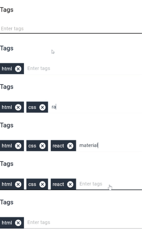
You should be familiar with ReactJS and have a little knowledge of Material UI. Also, you should be familiar with what is Tag Input. If not below is an example of that.
![tags.gif](https://cdn.hashnode.com/res/hashnode/image/upload/v1633587207597/lRt98C_6w.gif)

Now, this is something we will be creating in this tutorial.

### Implementation breakdown

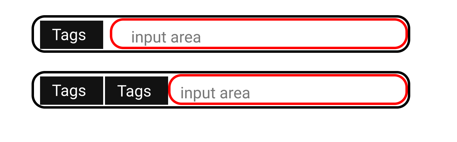
If you haven't already figured out the implementation, Let me break it down for you. What we are doing is having a tag component and input component side by side. So, when a tag is added is just decreases the input area.

Below is a visual breakdown of the component.
![image.png](https://cdn.hashnode.com/res/hashnode/image/upload/v1633587745607/83Sn8nS7T.png)

I hope, you already understood what we are gonna implement in this tutorial. As we gonna use Material UI implementation going to be really easy.

### Code Implementation

Once you have setup Reactjs and Material Ui create a new component say ` InputTags` and add material UI's `<TextField/>

```
export default function InputTags() {

  return (
    <Box sx={{ flexGrow: 1 }}>
        <TextField
          fullWidth
          variant='standard'
          size='small'
          sx={{ margin: "1rem 0" }}
          margin='none'
          placeholder="Enter tags here"
        />
     
    </Box>
  );
}

```


Now let's create our tag component and style it as we want.

```
const Tags = () => {
  return (
    <Box
      sx={{
        background: "#283240",
        height: "100%",
        display: "flex",
        padding: "0.4rem",
        margin: "0 0.5rem 0 0",
        justifyContent: "center",
        alignContent: "center",
        color: "#ffffff",
      }}
    >
      <Stack direction='row' gap={1}>
        <Typography>Tags</Typography>
        <Cancel/>
        />
      </Stack>
    </Box>
  );
};
```

we are done with the basics, we need a way to show the tags inside of the input component. Fortunately, we have a prop called `InputProps` in Material UI.
You can read all about this [here](https://mui.com/api/text-field/#props).

once we add the <Tags/> inside the InputProps out component will look like the below. Also 

```
const Tags = () => {
  return (
    <Box
      sx={{
        background: "#283240",
        height: "100%",
        display: "flex",
        padding: "0.4rem",
        margin: "0 0.5rem 0 0",
        justifyContent: "center",
        alignContent: "center",
        color: "#ffffff",
      }}
    >
      <Stack direction='row' gap={1}>
        <Typography>Tags</Typography>
        <Cancel/>
        />
      </Stack>
    </Box>
  );
};

export default function InputTags (){

return (
    <Box sx={{ flexGrow: 1 }}>
        <TextField
          fullWidth
          variant='standard'
          size='small'
          sx={{ margin: "1rem 0" }}
          margin='none'
          placeholder="Enter Tags here"
          InputProps={{
            startAdornment: (
              <Box sx={{ margin: "0 0.2rem 0 0", display: "flex" }}>## 
                    <Tags />
                  );
                })}
              </Box>
            ),
          }}
        />
    </Box>
)

}

```

once you render the above component you will see something like below on the screen.

![image.png](https://cdn.hashnode.com/res/hashnode/image/upload/v1633595194386/RYPF9uiMM.png)

Now we are done with the UI and design. Let's add logic to it.

### Adding logic to Input tag component.


Well, let's discuss how we gonna implement the logic here.


#### Algorithm

1. Here what we can do is create a Tag array where we keep all the tags and then by using javascript's `.map()` method we can display all the tags inside the `InputProps`

2. Also for adding new tags, we just create an `onSubmit()` method so that every time a user clicks on the entering button the tag will be added to the `Tags[]` array.

3. And for deleting we will create `handleDelete()` method and pass the tag name as a parameter so that when we run `.filter()` method on the `Tags[]` we can remove the tags we passed as a parameter.


#### Code Implementation of the above Algorithm.

-  Creating a `Tag[]` as a state. Also mapping the tags such that it will show in that 'InputProps' of the `<Textfield/>`  component.


```
  const [tags, SetTags] = useState([]);

```
also our `<TextField/>` will look something like below

```
<TextField
          fullWidth
          variant='standard'
          size='small'
          sx={{ margin: "1rem 0" }}
          margin='none'
          placeholder={tags.length < 5 ? "Enter tags" : ""}
          InputProps={{
            startAdornment: (
              <Box sx={{ margin: "0 0.2rem 0 0", display: "flex" }}>
                {tags.map((data, index) => {
                  return (
                    <Tags data={data}  key={index} />
                  );
                })}
              </Box>
            ),
          }}
        />
```
also, we change the `<Tags/>` component as follows.

```
const Tags = ({ data}) => {
  return (
    <Box
      sx={{
        background: "#283240",
        height: "100%",
        display: "flex",
        padding: "0.4rem",
        margin: "0 0.5rem 0 0",
        justifyContent: "center",
        alignContent: "center",
        color: "#ffffff",
      }}
    >
      <Stack direction='row' gap={1}>
        <Typography>{data}</Typography>
        <Cancel
          sx={{ cursor: "pointer" }}
        
        />
      </Stack>
    </Box>
  );
};
```


- Adding `onSubmit()` method and also `<form>` tags to the `<Textfield/>`. Also to get the input value we will use React hooks `useRef()`.

```
 const tagRef = useRef();

//HandleSubmit
 const handleOnSubmit = (e) => {
    e.preventDefault();
    SetTags([...tags, tagRef.current.value]);
    tagRef.current.value = "";
  };

```
also, we will change our `<TextField/> component as below.

```
 <form onSubmit={handleOnSubmit}>
        <TextField
          inputRef={tagRef}
          fullWidth
          variant='standard'
          size='small'
          sx={{ margin: "1rem 0" }}
          margin='none'
          placeholder={tags.length < 5 ? "Enter tags" : ""}
          InputProps={{
            startAdornment: (
              <Box sx={{ margin: "0 0.2rem 0 0", display: "flex" }}>
                {tags.map((data, index) => {
                  return (
                    <Tags data={data} key={index} />
                  );
                })}
              </Box>
            ),
          }}
        />
      </form>
```

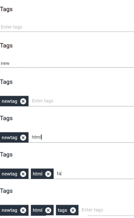
once done you will be able to add tags every time you click on the enter button.

here is a preview of what we have made so far.
![tagsInput.gif](https://cdn.hashnode.com/res/hashnode/image/upload/v1633597636710/gyiiDHfpq.gif)

- Adding a delete feature in our tags.

creating a `handledelete()` method.

```
  const handleDelete = (value) => {
    const newtags = tags.filter((val) => val !== value);
    SetTags(newtags);
  };
```
passing `handleDelete()` as a prop to <Tags/>

```


<TextField
          inputRef={tagRef}
          fullWidth
          variant='standard'
          size='small'
          sx={{ margin: "1rem 0" }}
          margin='none'
          placeholder={tags.length < 5 ? "Enter tags" : ""}
          InputProps={{
            startAdornment: (
              <Box sx={{ margin: "0 0.2rem 0 0", display: "flex" }}>
                {tags.map((data, index) => {
                  return (
                    <Tags data={data} handleDelete={handleDelete} key={index} />
                  );
                })}
              </Box>
            ),
          }}
        />

```

In `<Tags/>` component we map the `handledelete()` to our `<Cancel/>`icon and pass `{data}` as a parameter.

```
const Tags = ({ data, handleDelete }) => {
  return (
    <Box
      sx={{
        background: "#283240",
        height: "100%",
        display: "flex",
        padding: "0.4rem",
        margin: "0 0.5rem 0 0",
        justifyContent: "center",
        alignContent: "center",
        color: "#ffffff",
      }}
    >
      <Stack direction='row' gap={1}>
        <Typography>{data}</Typography>
        <Cancel
          sx={{ cursor: "pointer" }}
          onClick={() => {
            handleDelete(data);
          }}
        />
      </Stack>
    </Box>
  );
};
```
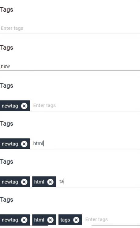
We are done, our component is ready so let's see the working of it.

#### Our final product.
![tagsInput.gif](https://cdn.hashnode.com/res/hashnode/image/upload/v1633598173806/aCDzYMExW.gif)


### Final Code

```
import { Cancel, Tag } from "@mui/icons-material";
import { FormControl, Stack, TextField, Typography } from "@mui/material";
import { Box } from "@mui/system";
import { useRef, useState } from "react";

const Tags = ({ data, handleDelete }) => {
  return (
    <Box
      sx={{
        background: "#283240",
        height: "100%",
        display: "flex",
        padding: "0.4rem",
        margin: "0 0.5rem 0 0",
        justifyContent: "center",
        alignContent: "center",
        color: "#ffffff",
      }}
    >
      <Stack direction='row' gap={1}>
        <Typography>{data}</Typography>
        <Cancel
          sx={{ cursor: "pointer" }}
          onClick={() => {
            handleDelete(data);
          }}
        />
      </Stack>
    </Box>
  );
};

export default function InputTags() {
  const [tags, SetTags] = useState([]);
  const tagRef = useRef();

  const handleDelete = (value) => {
    const newtags = tags.filter((val) => val !== value);
    SetTags(newtags);
  };
  const handleOnSubmit = (e) => {
    e.preventDefault();
    SetTags([...tags, tagRef.current.value]);
    tagRef.current.value = "";
  };
  return (
    <Box sx={{ flexGrow: 1 }}>
      <form onSubmit={handleOnSubmit}>
        <TextField
          inputRef={tagRef}
          fullWidth
          variant='standard'
          size='small'
          sx={{ margin: "1rem 0" }}
          margin='none'
          placeholder={tags.length < 5 ? "Enter tags" : ""}
          InputProps={{
            startAdornment: (
              <Box sx={{ margin: "0 0.2rem 0 0", display: "flex" }}>
                {tags.map((data, index) => {
                  return (
                    <Tags data={data} handleDelete={handleDelete} key={index} />
                  );
                })}
              </Box>
            ),
          }}
        />
      </form>
    </Box>
  );
}

```

## What we learned 

- How to use Material UI's `<Textfield/> 
- How to create a new custom component.
- How to add and delete data from the state.
- How to use useRef hook.
- How to create a custom Input Tag component

If you like the tutorial like the blog also give me a follow on [Twitter](https://twitter.com/theysaymaurya)

## Thank You


